
Delhi • Noida • Greater Noida • Gurugram • Faridabad
Living Room Interior Design: Layouts, Walls & Colour Ideas That Actually Hold Up
Search for inspiration and you'll find a thousand beautiful photographs and almost no explanation of why any of them work. What actually makes good living room design come together is a sequence of decisions, made in a specific order — furniture placement first, then how the walls are treated, then colour, then the smaller styling touches people notice last but remember longest. That's the order this page follows, because it's the order that keeps a project from needing a redo eighteen months later.
This guide is built around real living room interior design projects rather than a generic checklist, so you'll find honest trade-offs alongside the ideas — what works in a compact Noida apartment isn't always what works in a larger Gurugram floor plan, and the difference matters more than most inspiration boards let on.
The Basics
Start With Function, Not a Mood Board
Few rooms in a home are asked to do as many jobs at once. It hosts guests, carries most evening screen time, doubles as a homework table for a child, and sometimes has to fold in a small work corner without taking the whole space over. The strongest results come from deciding, before a single item is bought, which of these jobs matter most for your household and which ones can be handled adequately rather than perfectly.
Two households with an identically sized space rarely need the same plan. A couple who host often will want flexible seating and an open line of sight toward the dining table. A family with young children will lean toward durable upholstery, softened furniture edges, and storage that keeps everyday clutter out of view. Once you're clear on how the space actually gets used across a normal week, the choices that follow — arrangement, finishes, palette — take far fewer attempts to get right.
Maybe you're starting from an empty shell, trying to fix a space that's felt slightly wrong for years without being able to say why, or just gathering ideas before committing to anything. Either way, the sections ahead are split so you can jump straight to what you need — furniture arrangement, feature treatments, a colour pairing, or a style direction — without reading past what's already familiar to you.
Quick answer: Living room interior design should start with furniture placement and the walking path through the space, not colour. Get that sequence right first, and the wall treatment, palette and styling decisions become straightforward.
Browse By Topic
Living Room Interior Design Categories
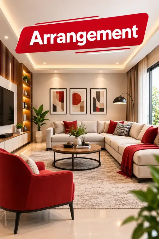
Arrangement First
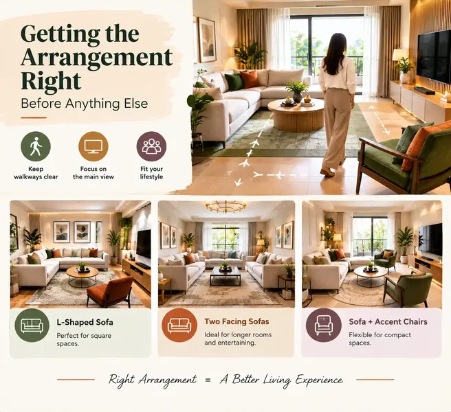
Getting the Arrangement Right Before Anything Else
Most complaints blamed on "the wrong sofa" or "the wrong shade" are actually arrangement problems in disguise. A sofa that's the correct size and fabric can still feel awkward if guests have to detour around it to reach a balcony, or if the television sits at an angle only half the seating can view without turning.
We start every project with three questions: where does the natural route through the space need to stay clear, what single object should the seating face — usually a screen or a fireplace-style focal wall — and how many people does the seating genuinely need to hold on an average day versus a rare large gathering. Those answers shape everything from sofa dimensions to whether a second accent chair earns its place.
- L-shaped sofa arrangement suits square or near-square footprints and forms a natural corner without cutting across a walking route.
- Two facing sofas work well in longer, rectangular footprints and read more formally — a good fit for homes that entertain regularly.
- A single sofa with movable accent chairs is the most adaptable choice for compact footprints, since chairs can be repositioned for extra seating without a fixed sectional dictating everything else.
Once seating is settled, the media unit, coffee table size and clearance around each piece all follow naturally — which is exactly why arrangement has to come before any conversation about style direction or colour.
Wall Design
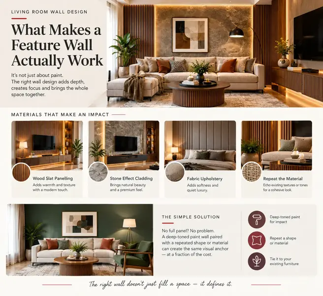
Living Room Wall Design: What Makes a Feature Wall Actually Work
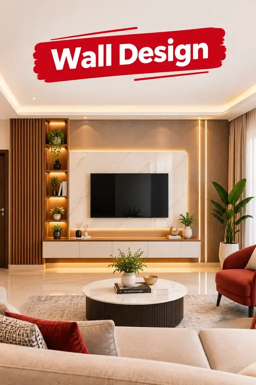
Living room wall design gets treated as a purely decorative call, but the ones that photograph well usually earn it through material choice, not paint alone. A textured, panelled or fluted surface behind the sofa or media unit does two things a flat coat of paint can't — it adds depth that visibly shifts with the light through the day, and it gives the eye one clear place to settle in a space that already has plenty competing for attention: a screen, a rug, a table, several cushions.
Material matters more than pattern. Wood-slat panelling, a stone-effect cladding, or a fabric-upholstered section each bring a different mood, but one rule holds across all of them — repeating something already present elsewhere in the space reads as intentional. A wood tone that echoes a console table, a texture that nods to a woven rug. Introduce a completely unrelated finish with nothing else to tie it to, and it tends to look bolted on rather than designed in.
Where a full panelled treatment isn't in the budget, a simpler version of the same idea still holds up: a single deep-toned paint surface behind the seating, paired with a styling choice that repeats a shape or material from the furniture nearby. That's usually enough to give a room the same visual anchor a material change would provide, at a fraction of the spend.
Wall Decor
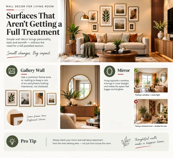
Wall Decor for Living Room Surfaces That Aren't Getting a Full Treatment
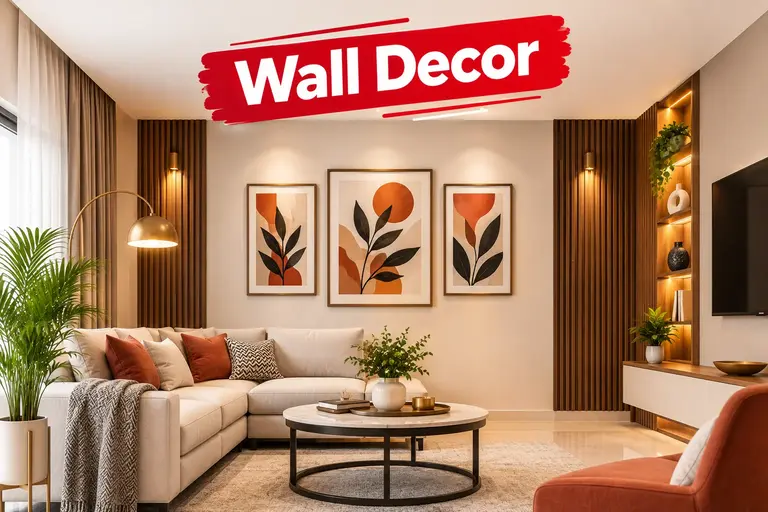
Not every space needs — or has the length for — a full panelled section, and simple wall decor for living room walls is where most of our clients actually stamp their own taste on a project without touching the carpentry budget. A gallery arrangement of framed art or photographs works best when the pieces share a common frame tone or matting, even if the images themselves have nothing in common, since that consistency is what keeps the arrangement from reading as cluttered.
A mirror deserves its own mention here. Hung opposite a window, it genuinely increases how much daylight moves through the space — more noticeable in a Delhi NCR apartment with one main window than most people expect until they've seen it done. Hang it facing a cluttered corner instead, and it only doubles the mess, so always check placement from the main seat, not just from across the room.
Colour Palette
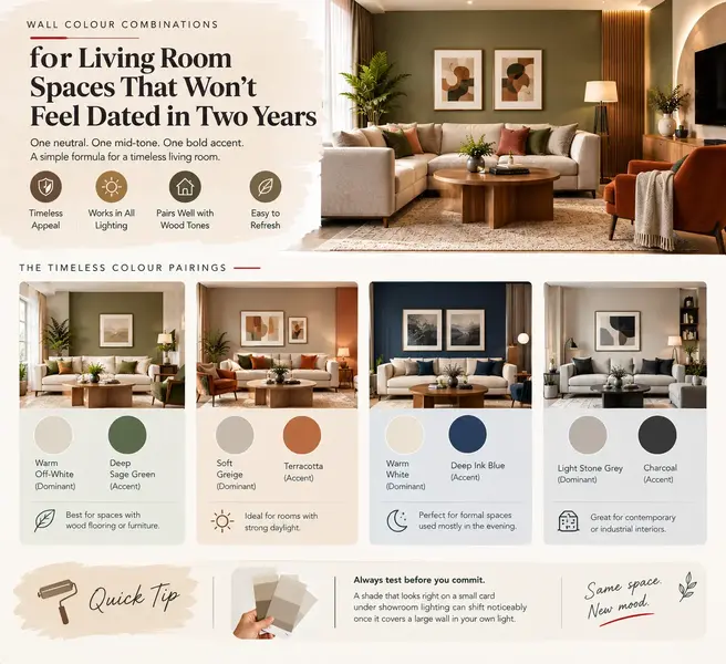
Wall Colour Combination for Living Room Spaces That Won't Feel Dated in Two Years
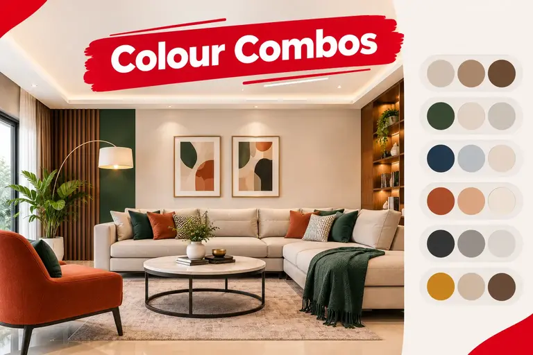
Choosing a wall colour combination for living room walls is one of the easiest calls to overthink. Spaces that hold up well over several years almost always follow the same simple structure: one dominant neutral across the largest surfaces, one mid-tone reserved for a single accent, and a third, bolder shade kept to small, swappable pieces — a cushion, a framed print, a vase — rather than applied to a second or third surface.
Warm off-whites and soft greiges remain the safest dominant base for this climate, since they hold their character under both daylight and warm evening bulbs without turning cold or clinical after sunset the way stark white sometimes does. For the accent, muted sage, warm terracotta, and deep ink blue are the three pairings we're asked for most right now, each sitting comfortably against wood-toned furniture without needing a full repaint.
| Dominant Base | Accent Pairing | Best Suited For |
|---|---|---|
| Warm off-white | Deep sage green | Spaces with wood flooring or furniture |
| Soft greige | Terracotta or burnt orange | Rooms with strong daylight through the day |
| Warm white | Deep ink or navy | Formal spaces used mostly in the evening |
| Light stone grey | Charcoal or graphite | Contemporary or industrial-leaning interiors |
Whatever pairing you settle on, test it on the actual surface before committing to the whole area. A shade that reads correctly on a small card under showroom lighting can shift noticeably once it covers a large expanse catching your specific mix of daylight and evening light.
Style Direction
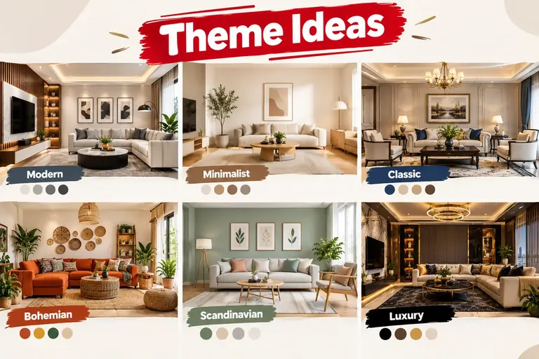
Living Room Theme Ideas: Finding a Style Direction That Suits the Space You Have
Terms like "modern" and "contemporary" get used interchangeably, but as living room theme ideas they point in genuinely different places, and picking the wrong one is one of the more common regrets we hear from people who worked purely off inspiration photos rather than their own proportions and light.
Warm Minimalist
Fewer pieces, more negative space, one or two objects doing the visual work instead of a fully accessorised room. Especially forgiving in smaller footprints.
Contemporary
Curved silhouettes, mixed textures, a neutral base with one or two bold accents; a moving target that shifts every few years rather than a fixed look.
Traditional
Rich wood tones, detailed mouldings, classic furniture forms, still common in Delhi's older bungalow-style homes and larger family spaces.
Industrial
Exposed textures, metal accents, a darker palette; requested more often for open-plan living-cum-dining areas than compact apartments.
Scandinavian
Light wood, soft neutrals, strictly functional furniture, which tends to read calm and open in a smaller footprint.
The honest way to choose between these isn't picking whichever you admire most in photographs — it's checking which one matches how much daylight your space actually receives and how much upkeep you're genuinely willing to do. A warm minimalist or Scandinavian direction forgives a smaller, dimmer footprint far better than a heavily layered traditional look, simply because there's less competing for the eye.
Multi-Use
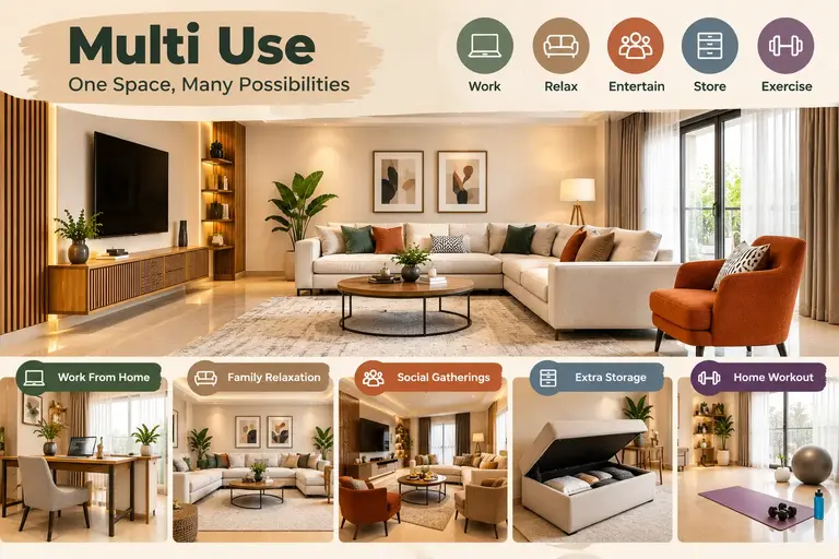
Interior Ideas for Living Room Spaces That Do More Than One Job
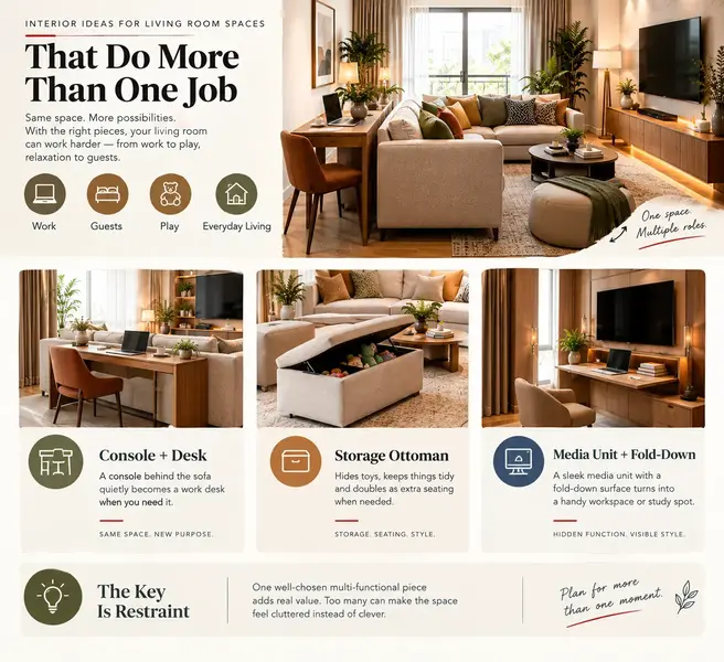
A growing share of our projects now have to double as something else — a work-from-home corner, an occasional guest sleeping spot, or a play zone for younger children that needs to disappear when company arrives. These aren't separate problems to solve; they're the same planning exercise, just accounting for a second function from the outset instead of retrofitting one later.
A console behind the sofa that quietly becomes a desk, a storage ottoman that hides toys and doubles as extra seating, and a media unit with a fold-down surface are the three additions we're asked to fit in most often. What makes them work is restraint — one multi-functional piece handled well reads as clever; three or four competing for attention in the same footprint starts to feel like a compromise instead of a solution.
Styling Details
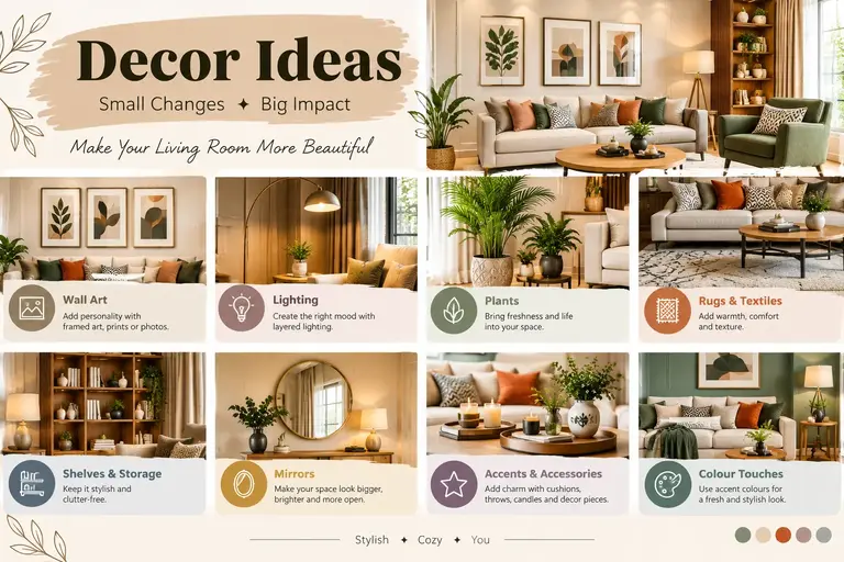
Living Room Decor Ideas That Change How a Space Feels Daily
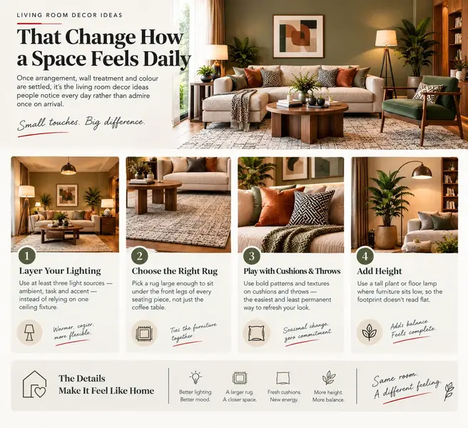
Once arrangement, wall treatment and colour are settled, what's left is the set of living room decor ideas people notice every day rather than admire once on arrival. Lighting sits at the top of that list — a space lit by a single central fixture almost always feels flatter than the same footprint with a floor lamp, a table lamp and a dimmed ceiling light working together, even though the second setup can cost less than the first.
A rug comes next. Sized correctly, it should sit under at least the front legs of every seating piece in the group, tying the furniture together visually instead of leaving pieces looking like they're floating on bare flooring. Cushions and throws are the easiest and least permanent way to refresh a look seasonally, and they're also the safest place to bring in a bold pattern that would feel like too much commitment applied to an entire surface.
- Layer at least three light sources — ambient, task and accent — instead of relying on one ceiling fixture
- Choose a rug large enough to sit under the front legs of every seating piece, not just the coffee table
- Keep bold pattern choices to soft furnishings you can swap without touching paint or carpentry
- Add height with a tall plant or floor lamp where furniture sits low, so the footprint doesn't read flat
Room Size
Compact Footprints vs Larger Ones: What Actually Changes
A tight footprint and a generous one aren't solving smaller or bigger versions of the same brief — the priorities shift entirely. In a compact space, the goal is almost always reducing visual noise: fewer pieces, one unified colour instead of several accents, and furniture with visible legs rather than skirted bases, since a gap between the furniture and the floor reads as more openness than the same footprint with everything sitting flush to the ground.
In a larger footprint, the risk runs the other way — furniture and styling spread too thin, leaving it feeling empty rather than generous. Splitting a big space into two or three defined zones, such as a seating group and a separate reading corner, usually solves this better than simply buying larger furniture to fill the gap.
Materials
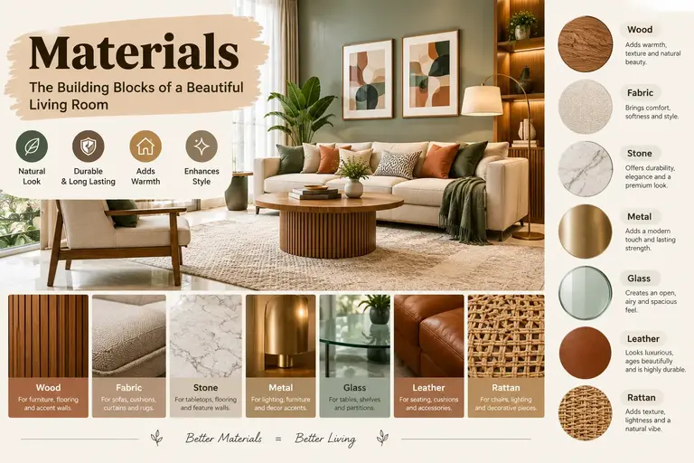
Materials Worth Choosing Correctly the First Time
Furniture and panelling in a shared family space see more daily use than almost anywhere else in the home, so material choice matters as much here as it does for a wardrobe or kitchen cabinet. For upholstery, a performance-rated fabric is worth the modest premium over a purely decorative one, particularly with children or pets in the house. For panelling, MDF finished with veneer or laminate gives a cleaner, more consistent result than solid wood at a lower cost, while still holding up well away from direct moisture.
| Element | Recommended Material | Why It Holds Up |
|---|---|---|
| Sofa upholstery | Performance-rated fabric | Resists daily wear and cleans easier than decorative-only fabric |
| Feature surface panelling | MDF with veneer or laminate | Consistent finish at a lower cost than solid wood |
| Coffee & console tables | Engineered wood, sealed top | Resists water rings and daily scuffs better than untreated wood |
| Rug | Low-pile wool or wool-blend | Holds colour and shape under regular foot traffic |
Before You Commit
Mistakes That Show Up Without an Overall Plan
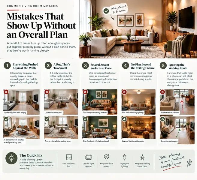
A handful of issues turn up often enough in spaces put together piece by piece, without a plan behind them, that they're worth naming directly.
- Everything pushed against the walls. It looks tidy on paper but usually leaves a dead, unused gap in the middle instead of a real gathering spot.
- A rug that's too small. If it only fits under the coffee table, it shrinks the footprint visually rather than anchoring it.
- Several accent surfaces at once. One considered focal point reads as intentional; three competing for attention cancel each other out.
- No plan beyond the ceiling fixture. This is the single most common oversight we correct during a redo.
- Ignoring the walking route. Furniture that looks right in a photo can still block the natural path from the entry to a balcony or dining area.
Budget & Timeline
What a Realistic Living Room Interior Design Project Looks Like
Most delays on a living room interior design project come from the same two sources — a material that was ordered late because a decision took longer than planned, and a scope that quietly grew mid-project because a "quick styling refresh" turned into a full wall treatment once the room was already opened up. Neither is a disaster, but both are avoidable with a bit of upfront planning, which is why we push clients to make the bigger calls first: layout, wall treatment and colour, in that order, before a single soft furnishing is chosen.
Styling-Only Refresh
New lighting, a rug, cushions and art, with no carpentry, can usually be completed within a week or two once the pieces are sourced.
Feature Wall or Media Unit
A project that includes a feature wall or a custom media unit typically runs three to five weeks from design approval to handover, largely dictated by how long panelling or upholstery takes to fabricate.
Full Room From an Empty Shell
A full room done from an empty shell, including electrical rework for a proper lighting layout, tends to sit closer to five to seven weeks.
Cost follows a similar logic to timeline. A styling-only update can often be done for a modest sum, since most of the budget goes toward soft furnishings and lighting fixtures rather than carpentry. Adding a feature wall or a built-in media unit moves the number up meaningfully, and a full living room design carried out from scratch — furniture, wall treatment, lighting and styling together — represents the larger end of the range, though it also tends to deliver the most cohesive result precisely because every decision was made with the others in mind rather than bolted on separately over time.
Our Process
How We Approach a Project Like This
Every project starts with a site visit rather than a proposal, because your space's actual light, wall lengths and walking routes matter more to the outcome than any reference photo. From there, we work through arrangement first, follow with wall treatment and a palette suited to the light, and only bring in the smaller styling choices — lighting, rugs, art — once the larger calls are settled. That sequence isn't a formality; it's the difference between a project redone within two years and one that still works for the household a decade on.
Site Visit & Brief
We visit the space to understand its actual light, wall lengths and walking routes, and talk through which jobs the room needs to do.
Arrangement First
Furniture placement and the walking path are decided before any conversation about wall treatment, colour or styling.
Wall Treatment & Palette
A feature wall approach and a colour palette suited to the room's light are chosen once the arrangement is settled.
Styling & Handover
Lighting, rugs, art and the smaller styling choices are brought in last, once the larger decisions are already in place.
Frequently Asked Questions
Living Room Interior Design Questions, Answered Directly
Furniture placement relative to the main walking path should be decided before colour or styling. Once seating and the media wall are fixed, everything else follows more easily.
Choose one dominant neutral for the largest surfaces, one mid-tone for a single accent wall, and reserve your boldest shade for small, changeable pieces like cushions or art.
Layered lighting, a correctly sized rug, and coordinated soft furnishings change how a space feels far more than their price would suggest.
It works best when it repeats a material or tone already present elsewhere in the space, rather than introducing something entirely unrelated.
Smaller spaces benefit from multi-functional furniture, one unified colour instead of several accent walls, and storage that goes up rather than out.
Start Planning Your Space
Move From Inspiration Photos to an Actual Plan
If you're ready to move from inspiration photos to an actual arrangement, wall treatment and colour plan built around the space you have, book a free consultation — we'll start with a site visit, not a template.